MOKA
Sheena Maucuer
Choose
Product Designer
→ Led UX research to identify friction points in the search and filtering journey, prioritising low-effort, high-impact improvements.
These refinements turned an overloaded search into a smoother, more premium experience, achieved with minimal development effort.
2 weeks sprint (2025)
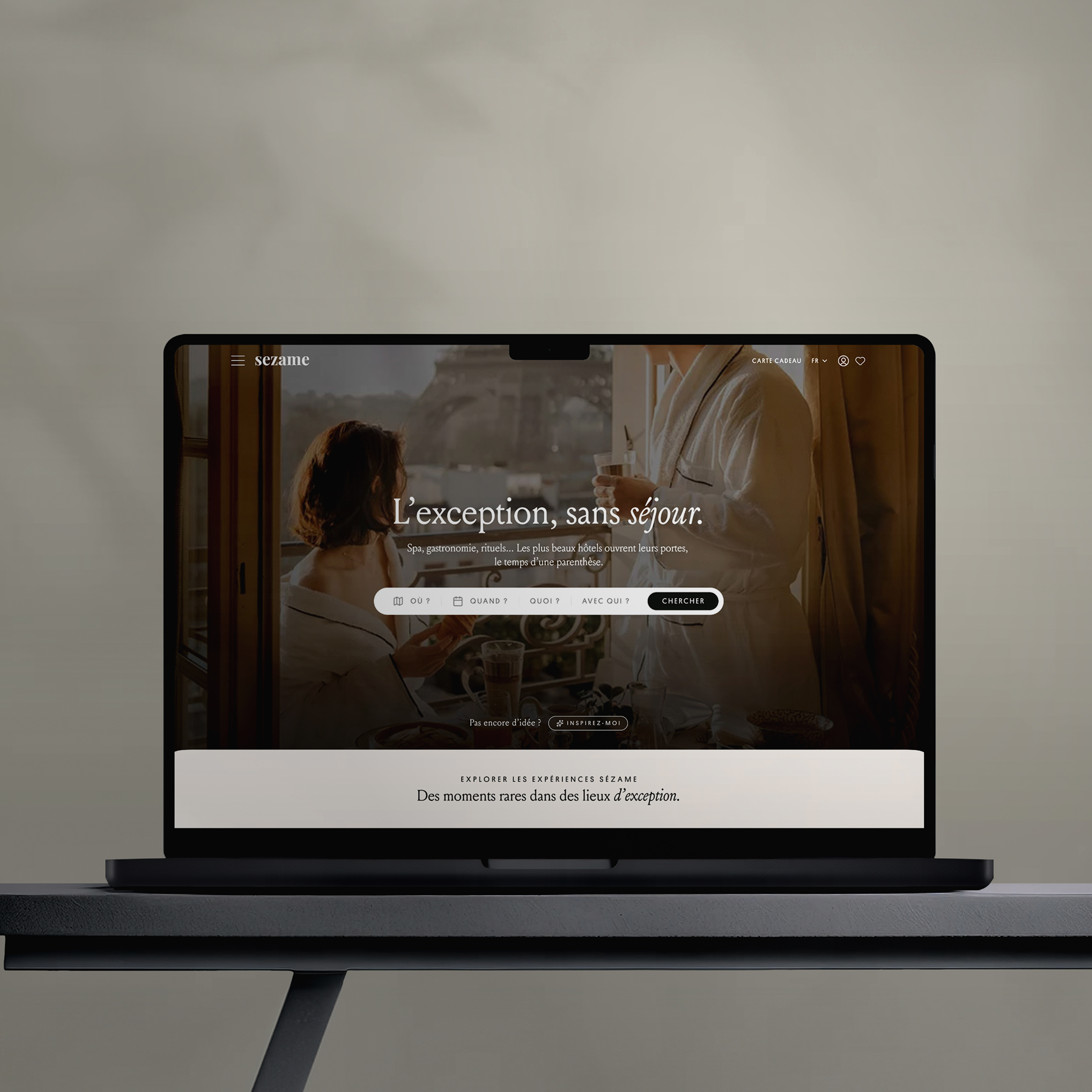
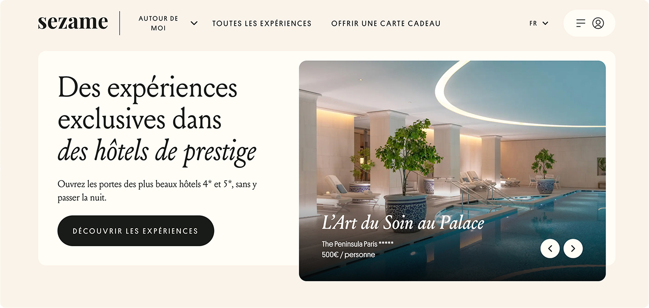
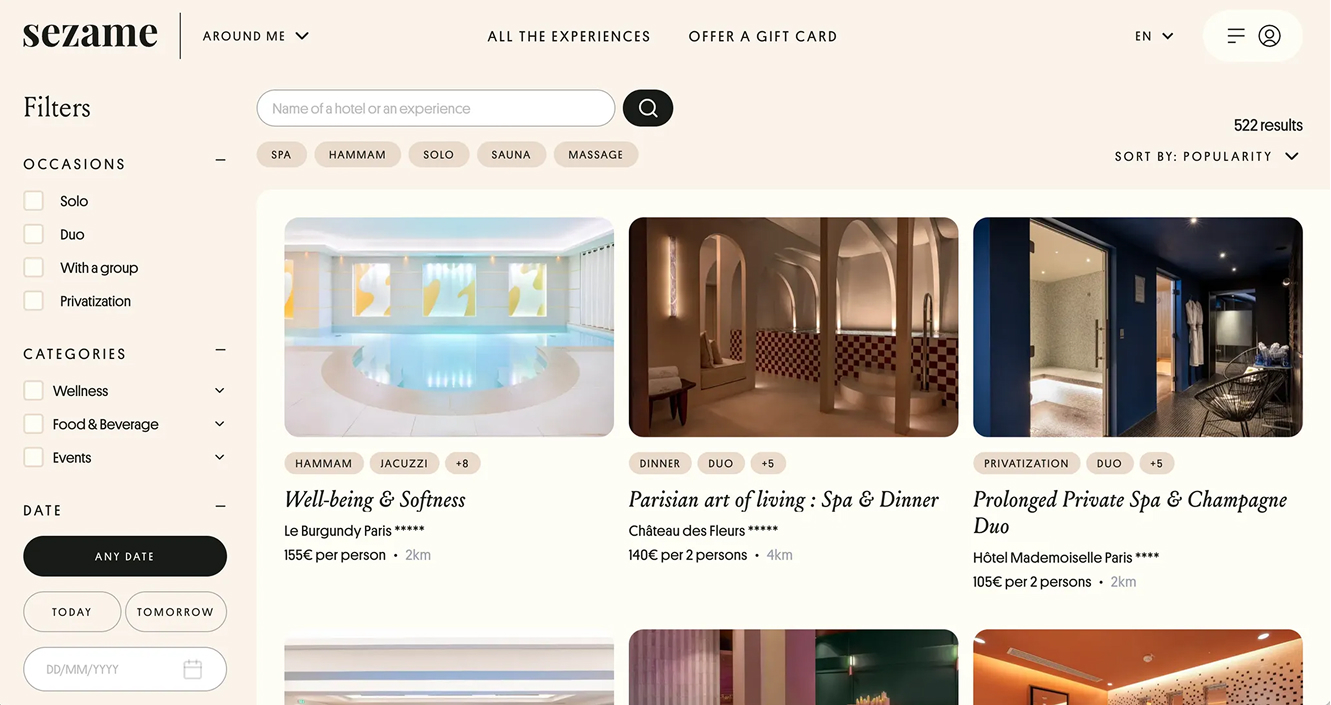
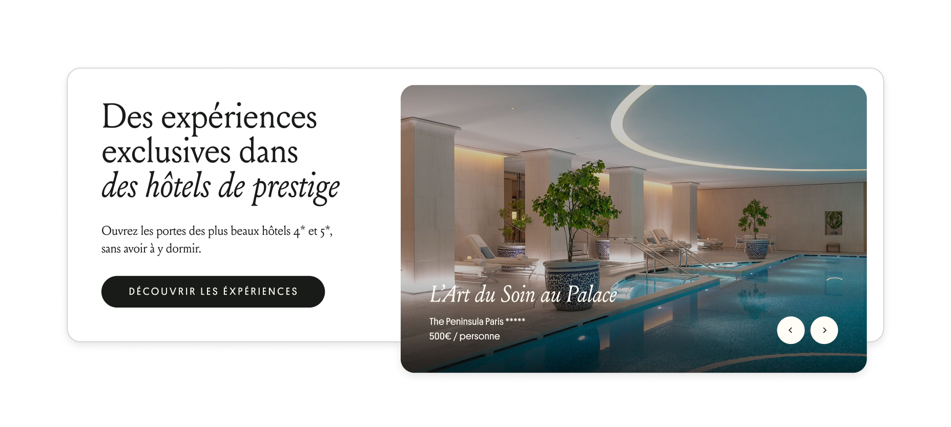
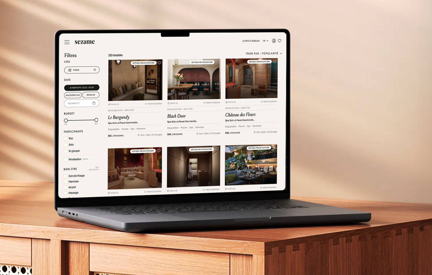
Sezame opens the doors of the most prestigious 4- and 5-star hotels, offering access to their finest experiences without the need for an overnight stay. The ambition is not only to curate premium experiences, but to craft a journey that feels effortless, refined, and inspiring, beginning the instant a guest arrives on the site. Today, the search journey requires too much cognitive effort. The result: abandonment, frustration, and a diluted high-end image.
KickoffDiscoveryBusiness Analysis : Understanding the Product
User Personas & Scenarios
User Journey Map
Pain Points Listing and Analysis
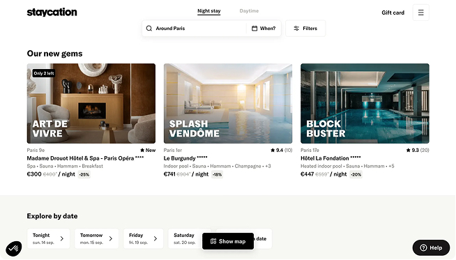
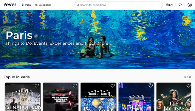
IdeationBenchmark
Solutions
Effort/Impact Matrix
Roadmap
UI & PrototypingWireframing & visual design
Prototyping
User TestingTest objectives & protocoDelivery
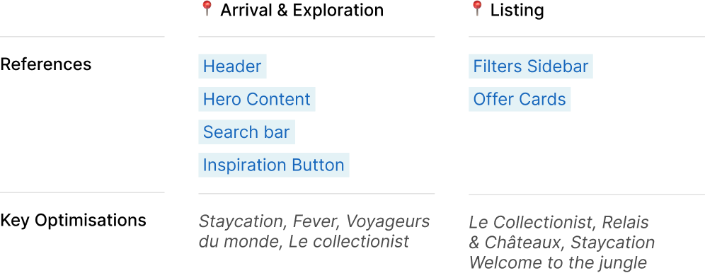
UX analysis of the key steps in the Sezame experience search journey (Arrival & Exploration, Listing) includes a list of observations and their impact on the users, based on defined personas and scenarios.For full analysis please inquire.
Working Methods
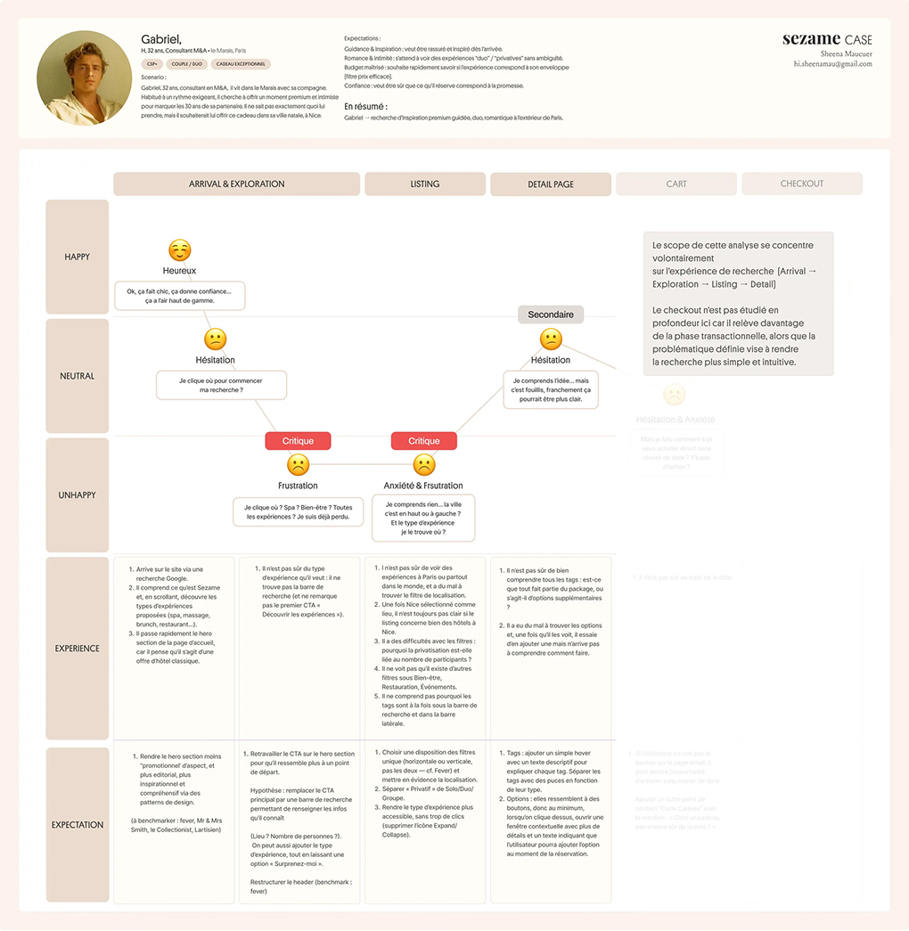
User Journey Maps: Gabriel
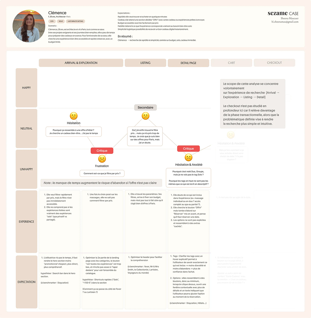
User Journey Maps: Clémence

M, 32 years old, M&A Consultant
CSP+ • Couple / Duo • Exceptional Gift
le Marais, Paris
Gabriel, 32, is an M&A consultant living in Le Marais with his partner. Accustomed to a demanding lifestyle, he is looking to offer a premium and intimate moment to celebrate her 30th birthday. He doesn’t know exactly what to choose, but he wants the gift to take place in her hometown, Nice.
Guidance: wants to be reassured and inspired from the very first step.
Romance & intimacy: expects “duo” or “private” experiences to be highlighted without ambiguity.
Trust: needs the confidence that what he books truly delivers on the promise.
In summary
Gabriel → is looking for inspiration, for a romantic duo experience outside of his current location.

F, 29 years old, Architect
CSP+ • Last-Minute Gift
Paris
Clémence, 29, is an architect living in Paris with her sister. Between demanding projects and long working hours, she rarely has time to plan gifts in advance. She values meaningful gestures but needs them to be effortless to organise. For her sister’s birthday, she’s looking to offer a massage, something simple, affordable, and quick to book.
Speed: wants to find and purchase within minutes.
Accessible budget: needs to filter easily by price
Reliability: expects the experience to clearly match what she’s looking for (solo massage).eeds the confidence that what he books truly delivers on the promise.
In summary
Clémence → seeks speed and simplicity, with a focus on budget, solo format, and immediate gift availability.
Analysis notes
Current state
Current state


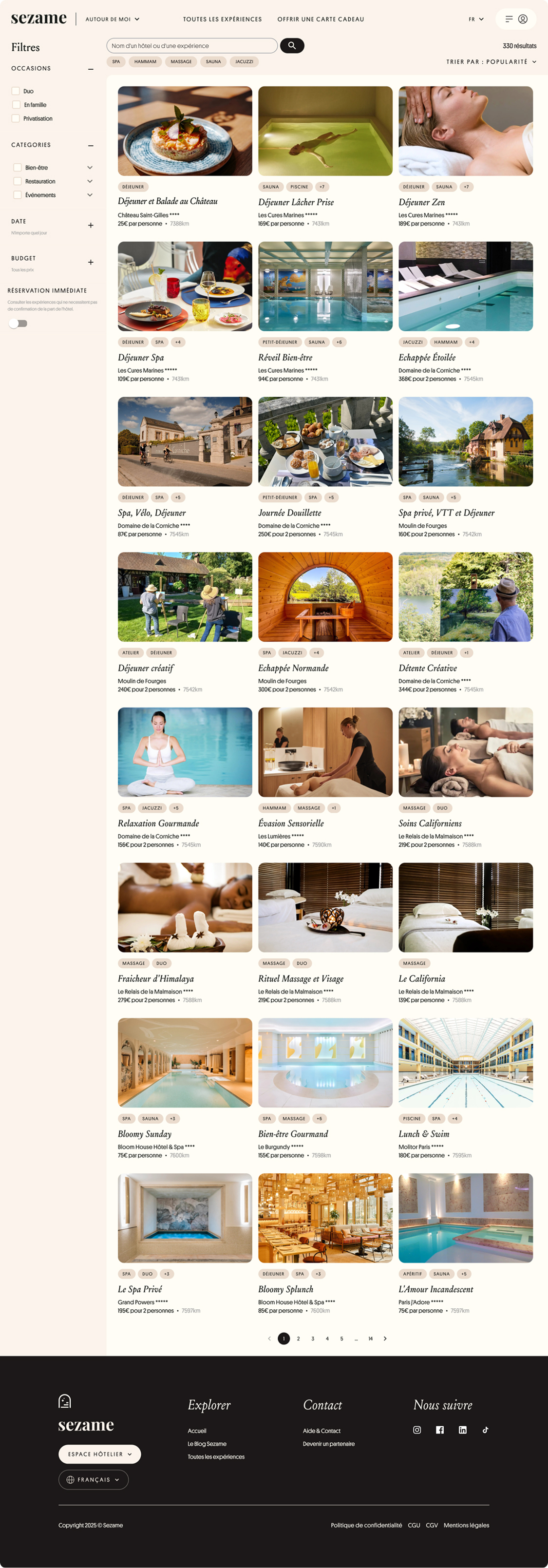
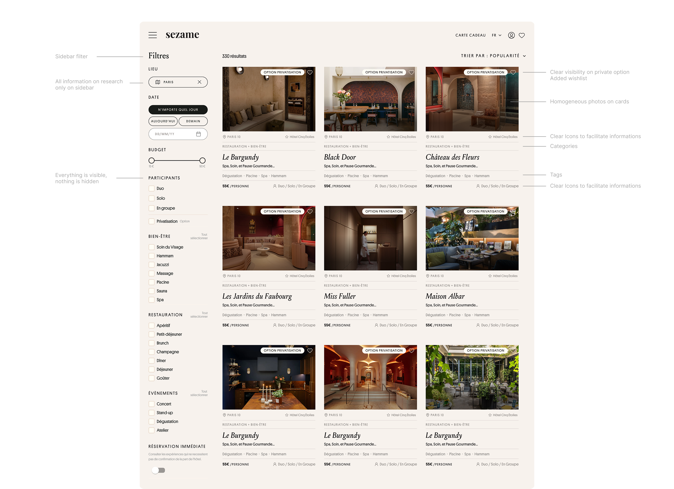
1. Clarify Filters
→ Clear chips & faceted navigation → reduces cognitive effort.
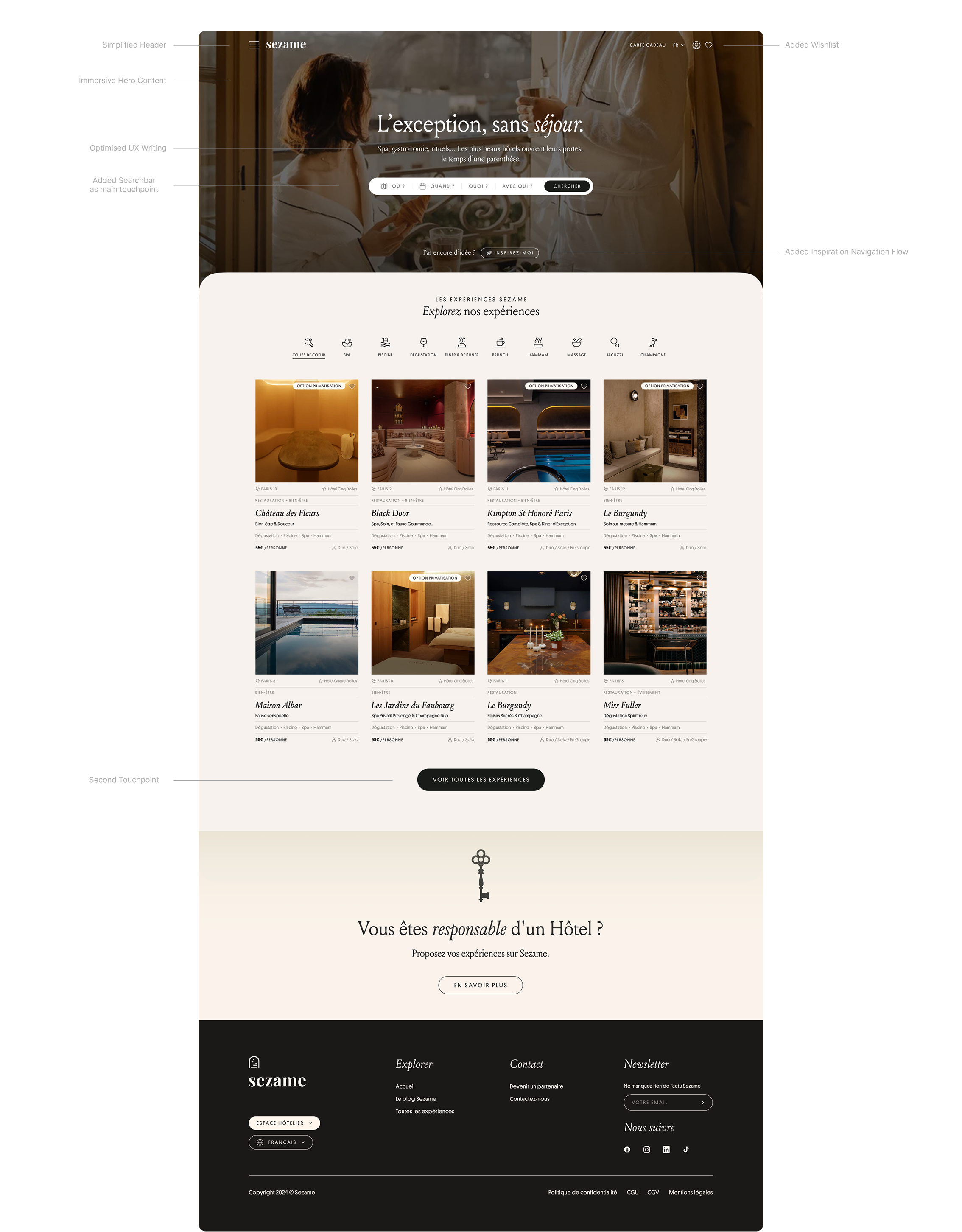
2. Optimise Header
+ 2. Hero Content
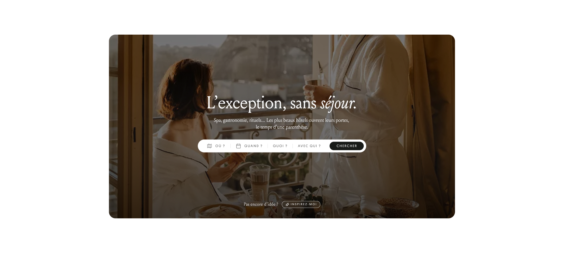
→ Central search bar
& single CTA → clarifies the entry point into the journey
→ Turn the header and hero into a true starting point: clear, premium, and easy to scan.
Redesign Cards
→ Clear hierarchy, consistent visuals, grouped tags
→ immediate readability and premium feel.
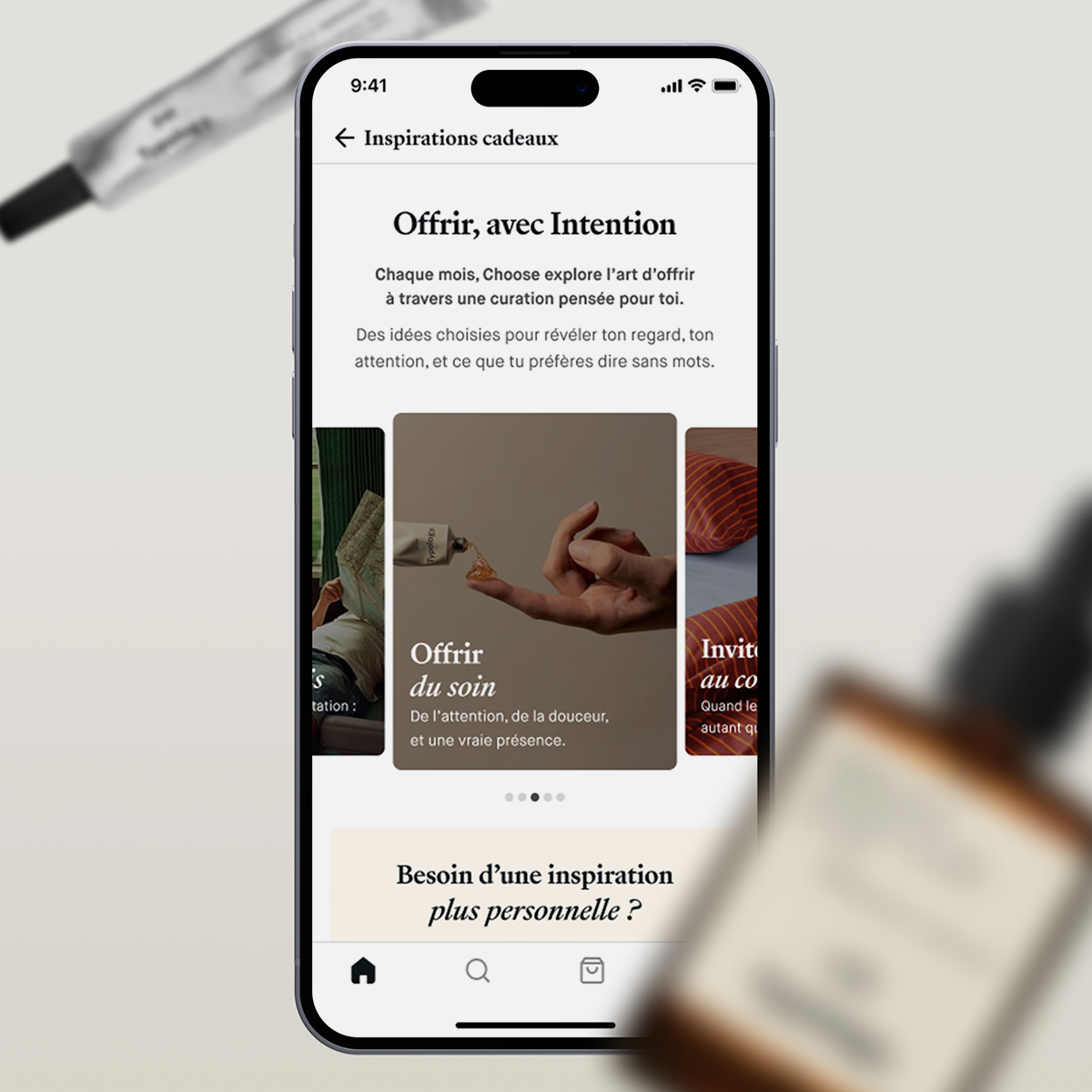
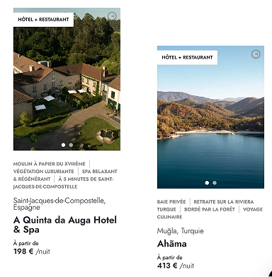
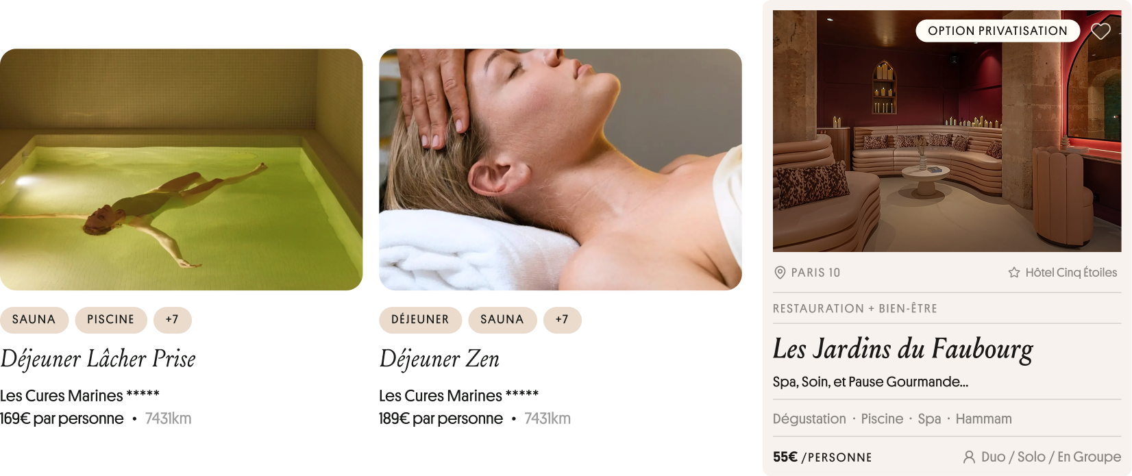
Inspiration
A digital concierge approach that both surprises and guides, combining refined visuals with intelligent recommendations.
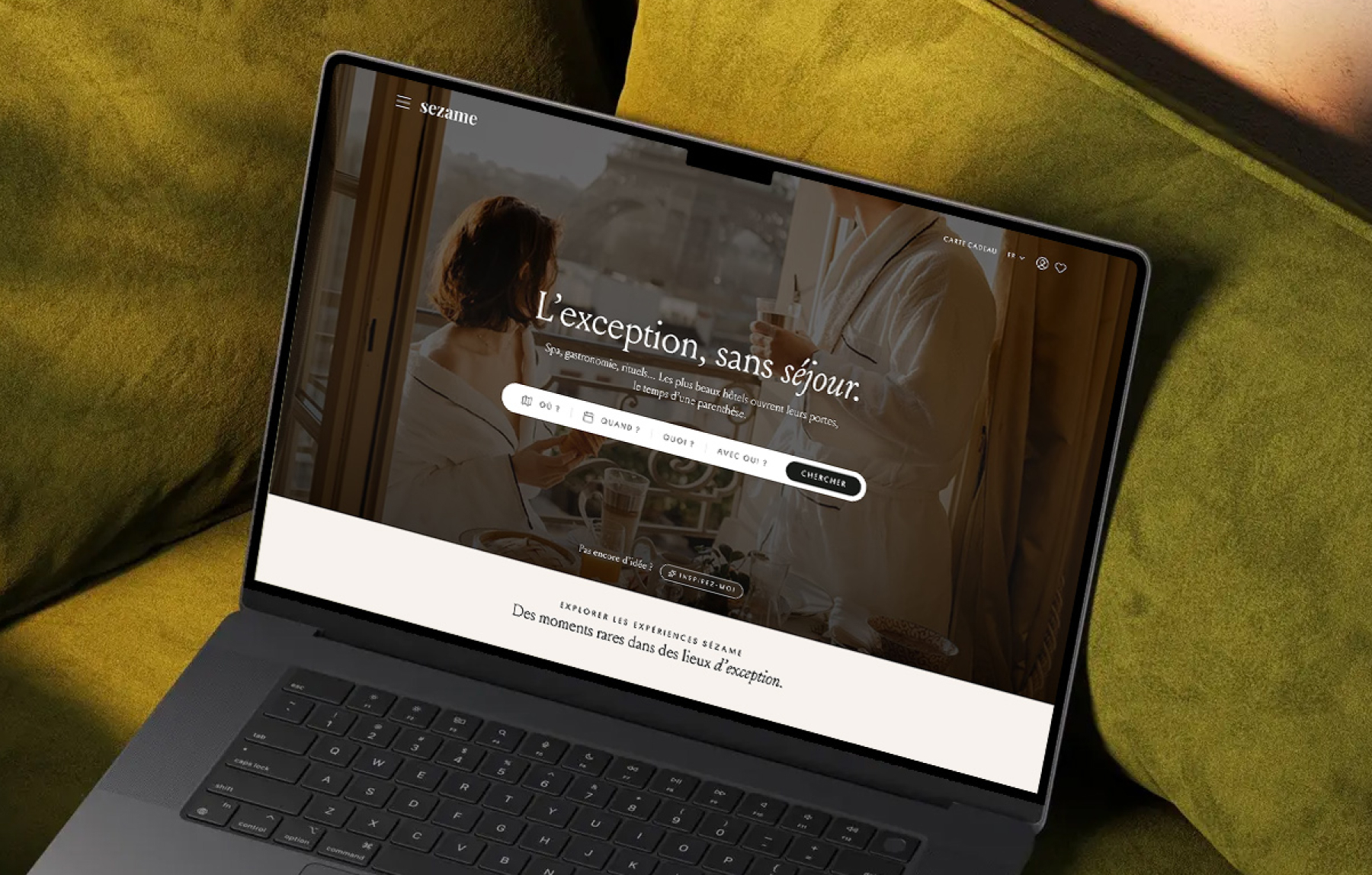
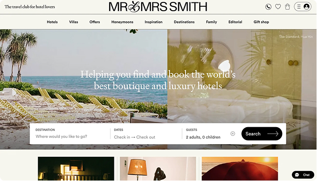
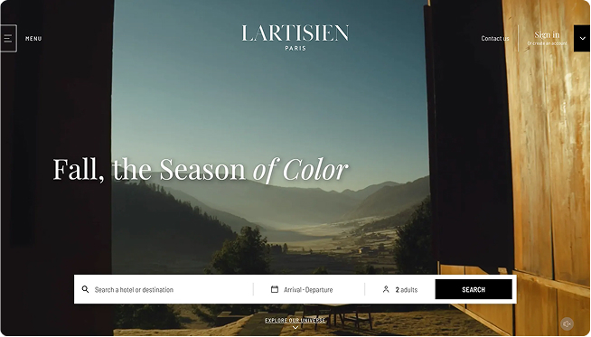
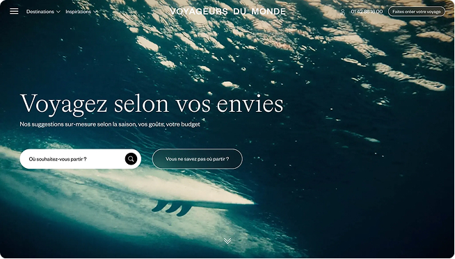
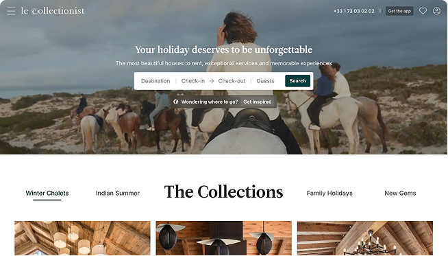
In the luxury space, the header isn’t just navigation, it’s a guide. Users should instantly know how to begin their journey. A large immersive visual, evocative copy, and an integrated search bar set the tone immediately.

Gift discovery conversion
→ % of users who click on a product
after seeing their results.
Multi-product purchase rate
→ % of quiz users who buymore than 1 gift.
Gift History page revisit rate
→ % of users who go back
to view a past gift they gave.